


As a frontend software engineer, developing clean and functional user interfaces is a big part of what I do. Building these interface components is a very expensive and effort consuming task. Making sure the UI works flawlessly involves a lot of testing: unit testing, manual testing, cross-browser testing, mobile responsiveness testing and plenty more.
There’s also the need for consistency in design as the components built are reused time and again in different user interfaces & sometimes even in different products within the organisation. And, the components need to follow the design guidelines set forth by our team’s designers.
So, how do we achieve all this effectively?
Storybook: The right way
Storybook is a tool for UI development. It makes development faster and easier by isolating components. This allows you to work on one component at a time. You can develop entire UIs without needing to start up a complex dev stack, force certain data into your database, or navigate around your application.
How it helps us?
- Makes it easy to build components in isolation, outside of your app.
- Standardizing styling across different projects.
- Increases developer awareness of existing components.
- Serves as a style guide and documentation.
- Visually test your components to prevent bugs.
Storybook also has a rich ecosystem of supported add-ons that extend Storybook’s functionality.
Getting Started with Web Components Storybook
npm init @open-wc
When looking to have the Storybook configuration files added to you project, be sure that you actively highlight ◉ Demoing (storybook) (with the Spacebar or right arrow key) in response to "Would you like to scaffold examples files for?" to ensure that those files are added to your project.
Storybook will look into your project's dependencies and provide you with the best configuration available:
- Install the required dependencies.
- Setup the necessary scripts to run and build Storybook.
- Add the default Storybook configuration.
- Add some boilerplate stories to get you started.
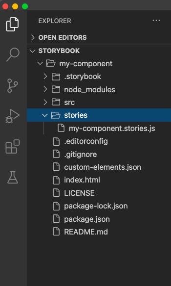
Now if you notice there are some extra folders added to your project:
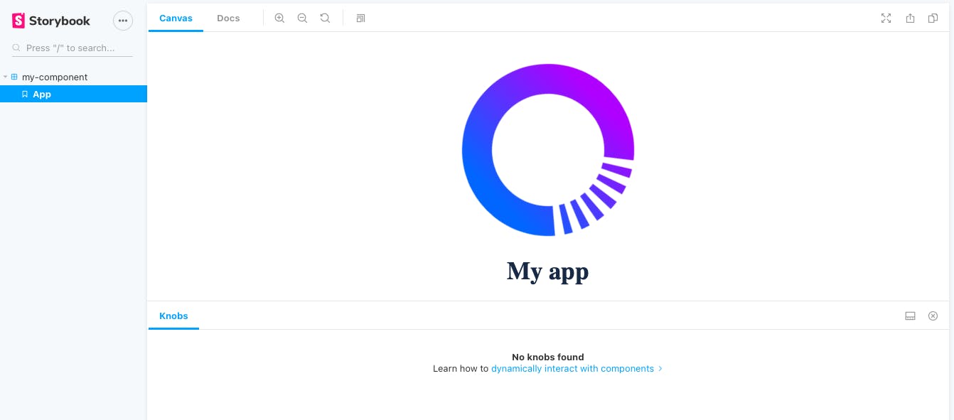
Check that everything worked by running:
npm run storybook
It will start Storybook locally and output the address. Depending on your system configuration, it will automatically open the address in a new browser tab.
Now let’s start building some component then we will see how we can configure storybook and make it more powerful and fully utilize its purpose.
So let’s create a basic component. Let’s start with a button.
//MyButton.js
import { LitElement, html, css } from 'lit-element';

export class MyButton extends LitElement {
  render() {
    return html`<button type="button">Click Me!</button>`;
  }

  static getStyles() {
    return css`
      button {
        background-color: #4caf50;
        border: none;
        color: white;
        padding: 15px 32px;
        text-align: center;
        text-decoration: none;
        display: inline-block;
        font-size: 16px;
        margin: 4px 2px;
        cursor: pointer;
      }
    `;
  }
}
//my-button.js
import { MyButton } from './MyButton';

customElements.define('my-button', MyButton);
Now let’s add a story for this component.
//my-button.stories.js
import { html } from 'lit-html';
import '../src/my-button.js';

export default {
  title: 'my-button',
};

export const Primary = () =>
  html`
    <my-button></my-button>
  `;
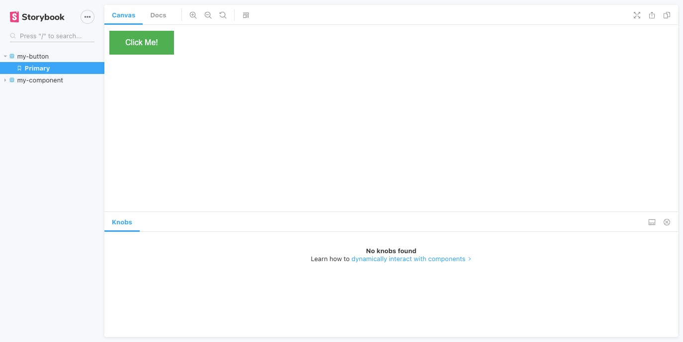
Let’s start the storybook server again and let’s see how our story looks.
Now let’s make our component a little more standard so we can expect some attributes and make changes.
//MyButton.js
import { LitElement, html, css } from 'lit-element';

export class MyButton extends LitElement {
  static get properties() {
    return {
      buttonText: { type: String }
    };
  }

  constructor() {
      super();
      this.buttonText = this.getAttribute("buttonText");
  }
  render() {
    return html`<button type="button" class="${this.buttonText.toLowerCase()}">${this.buttonText}</button>`;
  }

  static getStyles() {
    return css`
      button {
        background-color: var(--my-button-bg-color, #4caf50);
        border: none;
        color: var(--my-button-font-color, white);
        padding: 15px 32px;
        text-align: center;
        text-decoration: none;
        display: inline-block;
        font-size: var(--my-button-font-size, 16px);
        margin: 4px 2px;
        cursor: pointer;
      }
      .primary {
        background-color: var(--my-button-bg-color, #4caf50);
      }
      .danger {
        background-color: var(--my-button-bg-color, #cd2b2c);
      }
    `;
  }
}
We also need to update our storybook component to send in these attributes which we just added to our component.
//my-button.stories.js
import { html } from 'lit-html';
import '../src/my-button.js';

export default {
  title: 'my-button',
};

export const Primary = () =>
  html`
    <my-button buttonText="Primary"></my-button>
  `;

export const Danger = () =>
  html`
    <my-button buttonText="Danger"></my-button>
  `;
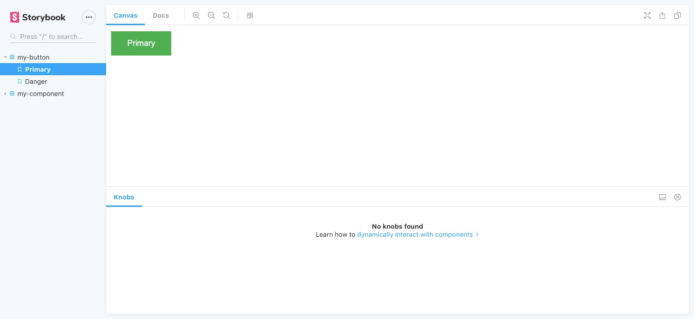
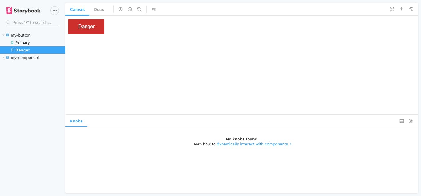
Now if we go back to our storybook we see two stories for our my-button component: Primary & Danger.
This is just the isolation part of the development. We developed a storybook component in isolation but how do we tell our fellow developers that we are expecting some attributes like buttonText and it can change the appearance of the button. That’s where storybook add-ons come in which makes storybook so powerful for building a component library.
Let’s start with the knobs add-on so that we can interact with our component. As we can see knobs add-on is already listed in .storybook/main.js file:
//main.js
module.exports = {
  stories: ['../**/stories/*.stories.{js,md,mdx}'],
  addons: [
    'storybook-prebuilt/addon-knobs/register.js',
    'storybook-prebuilt/addon-docs/register.js',
    'storybook-prebuilt/addon-viewport/register.js',
  ],
  esDevServer: {
    // custom es-dev-server options
    nodeResolve: true,
    watch: true,
    open: true
  },
};
Make the needed changes to .storybook/preview.js:
//preview.js
import { addParameters, addDecorator,setCustomElements } from '@open-wc/demoing-storybook';
import { withKnobs} from '@open-wc/demoing-storybook/'
addParameters({
  docs: {
    iframeHeight: '200px',
  }
});

addDecorator(withKnobs);

async function run() {
  const customElements = await (
    await fetch(new URL('../custom-elements.json', import.meta.url))
  ).json();

  setCustomElements(customElements);
}

run();
Base on the data in custom-elements.json we can automatically generate knobs for our stories. Let's modify our custom-elements.json file:
//custom-elements.json
{
  "version": 2,
  "tags": [
    {
      "name": "my-button",
      "description": "A custom built button component",
      "properties": [
        {
          "name": "buttonText",
          "type": "String",
          "description": "The content of your button",
          "default": ""
        }
      ],
      "events": [],
      "slots": [],
      "cssProperties": [
        {
          "name": "--my-button-font-size",
          "description": "Font size"
        },
        {
          "name": "--my-button-font-color",
          "description": "Font color"
        },
        {
          "name": "--my-button-bg-color",
          "description": "Background color"
        }
      ]
    }
  ]
}
To enable this feature we will need an additional decorator & make some changes in our story.
//my-button.stories.js
import { html } from 'lit-html';
import '../src/my-button.js';
import { text, withKnobs, withWebComponentsKnobs } from '@open-wc/demoing-storybook';

export default {
  title: 'my-button',
  component: 'my-button',
  decorators: [withKnobs, withWebComponentsKnobs],
  parameters: { options: { selectedPanel: 'storybookjs/knobs/panel' } },
};

export const Primary = () =>
  html`
    <my-button buttonText="Primary"></my-button>
    <style>
    html {
      --my-button-font-color: #fff;
      --my-button-font-size: 16px;
      --my-button-bg-color: #4caf50;
    }
  </style>
  `;

export const Danger = () =>
  html`
    <my-button buttonText="Danger"></my-button>
    <style>
    html {
      --my-button-font-color: #fff;
      --my-button-font-size: 16px;
      --my-button-bg-color: #cd2b2c;
    }
  </style>
  `;
Go back to the storybook server to see your newly added knobs in action.
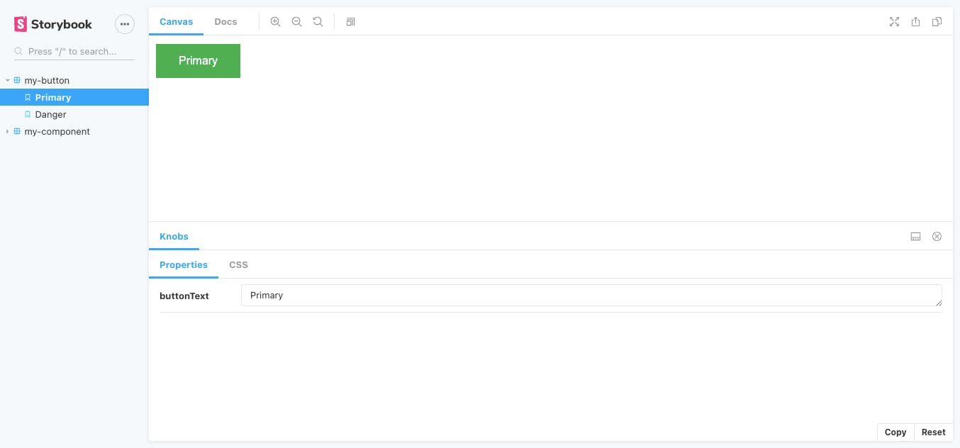
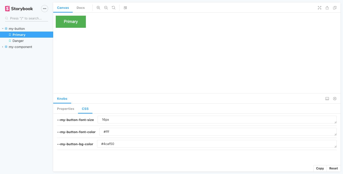
Now can change the Properties & CSS of our button component and see how it behaves with the change of states in real-time.
In addition to what we’ve looked at so far, Storybook also has a rich ecosystem of supported add-ons that extend Storybook’s functionality:
Viewport- This add-on works similar to the device simulator in the Google Chrome developer tools and allows you to view your components in various screen sizes and layouts. This is great for doing some responsiveness testing.a11y- This add-on does an accessibility audit on each of your examples and displays the results in Storybook. It can check for things like having an adequate colour contrast ratio or using appropriate aria roles and labels.
& many more.
Conclusion
Given all the benefits of using Storybook, I’ll never do UI development without Storybook again. We have barely scratched the surface. Its ability to help with testing, documentation, and knowledge-sharing is unmatched by any other tool I’ve come across so far. Highly recommended.